AUREVA
Logo & Packaging Design
2025
Objective
Develop a high-end minimalist skincare brand that feels timeless, understated, and grounded in quiet luxury — a brand that speaks softly but leaves a lasting impression.
What I've done
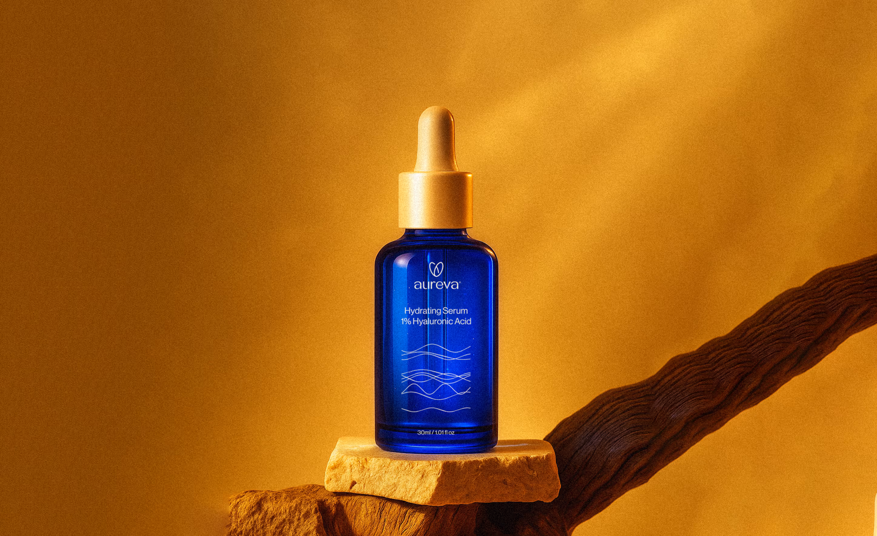
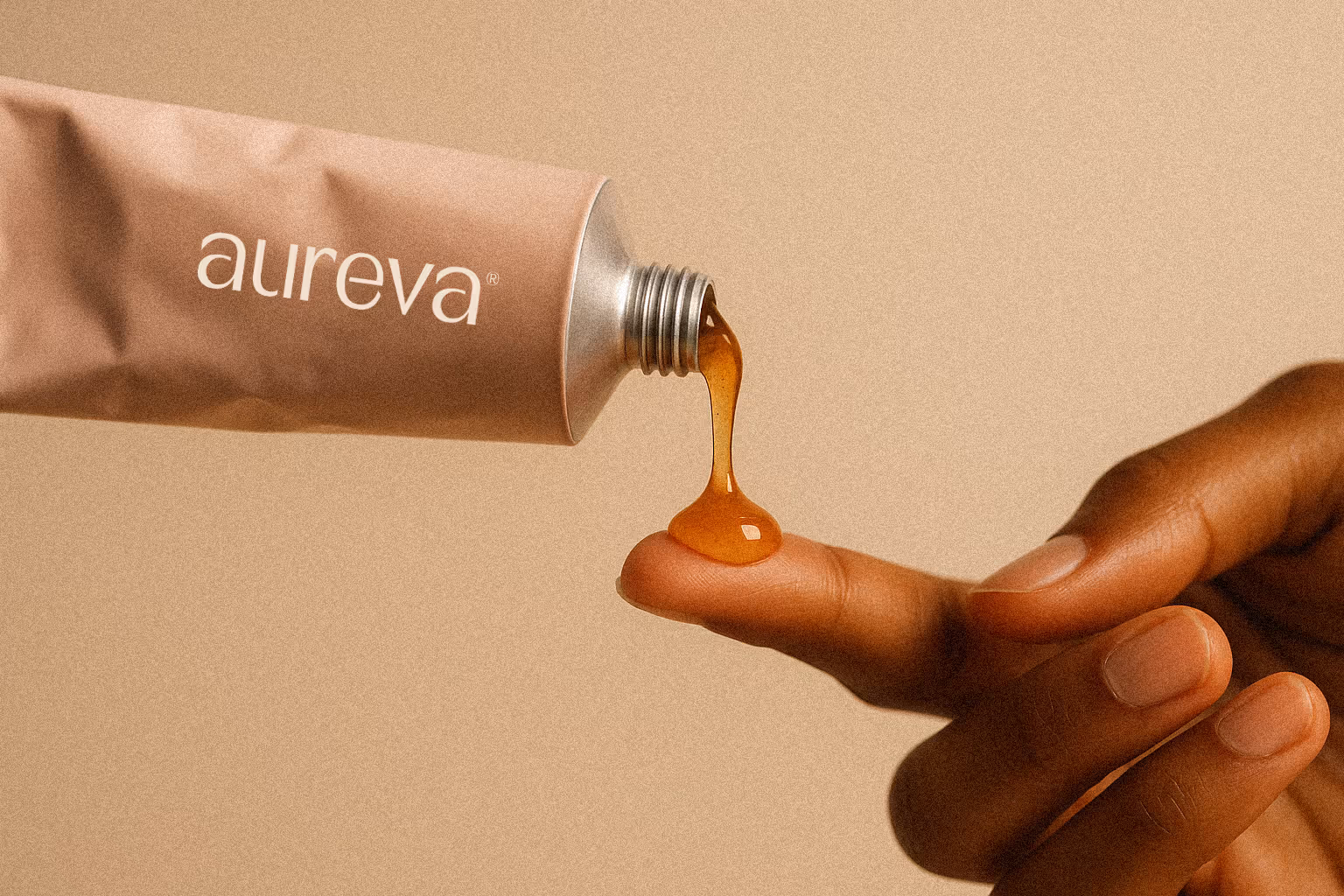
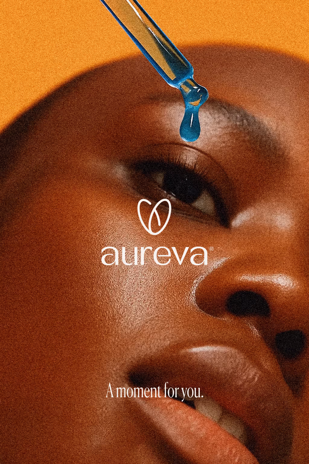
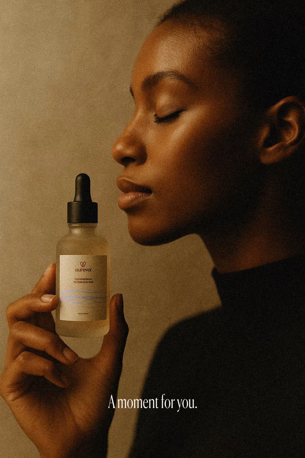
Created the full brand identity for Aureva, from naming and conceptual foundations to final visual execution. The logo is intentionally stripped back and quiet, with a clinical precision that conveys trust and professionalism. Typography choices are clean and neutral, avoiding decorative distractions to let the brand’s tone of calm confidence come through.
Creative Process
The design language is built around slowness and tactility. Surfaces are matte, tones are soft, and textures are subtle yet present. Every decision — from spacing to color palette — was aimed at evoking stillness and purity. Packaging design reflects this ethos, using minimal text and generous white space to let the product breathe. The brand world was extended through photography direction, focusing on natural light, delicate shadows, and honest close-ups that make the viewer feel like they are in the room with the product. The result is Aureva — a skincare brand that doesn’t chase attention, but earns it through presence.